Favorite paint colors: part two

Today we are going to hear from two of my favorite bloggers, Melissa from the beautiful blog, The Inspired Room and Seleta from the very chic but always down to earth blog, Simply Seleta.

When asked about color this is what Melissa had to say, “I have so many favorites. Paint colors are tricky, as you know. You can have a favorite that will NOT look good in everyone’s room. The lighting, existing finishes and things you have in the room can make a color look entirely different in someone else’s house.”  Good point..so take all of our suggestions this week with a grain of salt…remember to take in to account if you get bright sun or no sun or have porches covering the area outside of your windows..It makes a difference, I know from experience.

Melissa says that with that warning in mind, her favorites are everything on the “Restrained Gold” card from Sherwin Williams (SW). “The shades on that card are yellow without that lemon pastel look.” She adds that most people she recommends use these colors end up very happy with the choice.

Melissa also likes “Antique White” from Sherwin Williams, but she has it custom mixed by Benjamin Moore because she prefers Benjamin Moore (BM) paint quality. It is a wonderful creamy white that she used all over her last house. See more discussion on this color in her post here which also has the formula for having it made at Benjamin Moore.

Thanks Melissa! {Image from her kitchen!}

When Seleta from Simply Seleta responded to my questions about color I love how she replied…with lots of information and categories!..that girl is so organized..she must be, she has four children and a busy life! {Yes that is actually her, isn’t she beautiful and even better, she is so nice and fun!}

Seleta says her Favorite whites include
Navajo by Benjamin Moore (BM).  She says “it is creamy enough without any green undertones, yet still crisp and fresh looking.  I painted my cabinets this in our Georgia home and still love it!” She also suggests Niveous, also by BM, because “this one has a tinge of a yellow undertone.  It is my current wall color in our beach house, and is perfect for a home that gets very little direct light.  It’s a classic!”

Soft + Subdued Colors:
Seleta suggests Dunmore Cream [Ben Moore HC 29] she says it is the color of butter and is great as a neutral if you really want to warm up a room.  “It’s as classic as cashmere and pearls!” She also loves Oatmeal (BM 268).

Seleta loves green and has this to say:
Golden Delicious [BM 390]… just painted the backs of my white shelves this color and paired with Hable’s bead pattern – it’s edgy and delicious.  Great color for adding some punch in a space.”
Moselle [Duron ?]  “…this is definitely a secret weapon color.  If you’re looking for a murky soft green, this one is beautiful paired with gold or yellow and cream.  It’s a color of sheer elegance.”
Sweet Daphne [Ben Moore 529] “…oh I love this fertile green, it’s just like a fresh spring leaf  It’s the color of my four year old boy’s room and he loves it.  I paired it with a bright blue to add a masculine touch.  The best part about this shade of green is that it has quite a bit of versatility.”

Thanks Seleta..I just had to share her own words..she is so descriptive..both of these ladies are great writers and amazing bloggers…be sure and check them out!

Our favorite paint colors

This is a topic we all like to discuss ..the elusive perfect paint color..much like the perfect pair of jeans right???!  Always looking for the one that might change our life..make the bedroom more serene, brighten the kitchen, bring the whole room together etc..You get the picture, we care.  So I have recruited some of my favorite people to share with us their color favorites this week… let’s get started.

Tomorrow we will have Seleta from this wonderful style blog as well as Melissa from The Inspired Room!  Wednesday we will have tips from my dear friend Joetta of Shelterstyle and later in the week we will hear from the Nester and last but certainly not least, Joni from Cote de Texas.  So hold on to your paint brushes and get ready to take notes.

Aside from this great line up, I hope y’all will share YOUR favorite colors and tips in the comments..this is the time to de-lurk! I want this to be a wonderful conversation about paint and how it can so easily change our rooms!

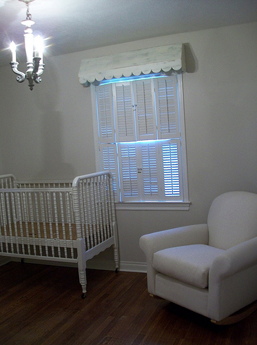
To start us off I am going to give my favorite colors.  I did not pull images to illustrate except for this first one : STONE 2 Laura Ashley from Lowe’s.  I apologize for the glare.  Looks like a sad color huh?? You are thinking, she is nuts…that looks like primer! But this room is tiny, and I knew I wanted to layer a lot of fabric and bring a lot in… and I know from many past uses, this color provides a great canvas to start with. So here is a fresh coat of Stone 2 BEFORE the room was loaded…pretty blah..so so, its ok…I means it’s barely there right?

and  AFTER with furniture and accessories…see the difference layers make…the paint looks darker with more white in the room. If I had gone darker to start with it would have not ended with the serene soft feel I wanted.  The point is keep in mind (of course!) what you will be bringing in..don’t just choose the color because it is pretty (I know this is obvious but i have to say) Also really put your swatches up near different shades of white and similar colors to really get an idea of its “true identity.” For instance, the contrast with the white white tree amd chair slipcover show there really is a whisper of beige in the paint…just enough for a tiny nursery.

I hate to ramble about Stone 2 but I want to explain a little more about this light neutral. Of course this is Baby Henry’s nursery. I get more emails asking about this color.  It just looks like off white linen…and unless you have white white trim (my trim is all extra white from SW) it will not even look beige/linen color it will just come off as “off white” or “antique white”..so it is not a rich color..similar but not even as rich as SW “swiss coffee” but our home is very small and I used it in the entry originally, the living room, the nursery and the hallway…it is my default color..and it works.  My theory is older homes that might have shabby/imperfect doors, cabinets, trim..well they look fresh if painted WHITE WHITE… if I was building  new construction I would still use a fairly clean and bright white because I like it but probably not EXTRA White from SW..does this make sense? Joetta will have some trim color suggestions for us as well so stay tuned.  Bottom line, my home is older, woodwork not perfect so I used lots of WHITE WHITE paint on older cabinets, wainscot etc to brighten and enlarge spaces and it works..LAURA ASHLEY STONE 2 is a great light neutral color for walls to work with white white wood/trim in this kind of situation. whewww..hope that made some sense…if you live in an older home, it probably did!

My other favorites..pictured in the top photo are from the Sherwin Williams strip with SW Urban Putty and SW Khaki Shade..my master bedroom is Urban Putty (you can see on my press page article).  It is a great color..works with a lot…these colors were not on the big SW color deck for years but they are back on the cute little fan deck!  So glad to see my old friends taken off the shelf because they are oldies but goodies. Of course they could always be mixed but I love being able to get a current sample swatch strip (or four or five!) Also pictured is what I think is a new color from SW??? Does anyone know..it is called SW Silvermist..very pretty ..reminds me of Restoration’s Silver Sage but lighter.  And while we are talking about SW, be sure and check out their online tool..the color visualizer!  So cool, you can even scan in your photos and then choose colors, click and drag and “paint” your rooms, trim, ceilings..very helpful!  And if you don’t want to upload photos you just use one of their stock room photos.  I am sure most of you know about this but just making sure! And no I dont endorse or prefer SW…I use it a lot and I obviously love some of their colors but I personally think Benjamin Moore has a better range..we’ll see what the experts says as the week progresses!  Check back often!

{edited to say:  I can’t believe I forgot another wonderful color, SW Hopsack, it is a yummy, rich caramel color..I have used in bathrooms (including own and I love it 5 years later), dining rooms and  an entry…it is good!}

Related Posts with Thumbnails